A power of extensive point of sale (POS) in a simple and elegant mobile app. How I helped ORTY shape their brand and user experience.

A power of extensive point of sale (POS) in a simple and elegant mobile app. How I helped ORTY shape their brand and user experience.

A power of extensive point of sale (POS) in a simple and elegant mobile app. How I helped ORTY shape their brand and user experience.

My scope

As a Senior Mobile Product Designer, responsible for UI/UX design, Prototyping, User Analytics. Later designed and maintained a cross-platform Design System.

Design objective

Design web-based back office, and mobile-first POS for mobile devices (tablet end phone). App should help users manage sales with no need for a traditional stationary POS and cash register.

Company was already operating in the EU market with stationary POS devices. Due to the rising trend toward mobility and ease of use, leadership decided to launching a new, mobile-first product.

Company was already operating in the EU market with stationary POS devices. Due to the rising trend toward mobility and ease of use, leadership decided to launching a new, mobile-first product.

Company was already operating in the EU market with stationary POS devices. Due to the rising trend toward mobility and ease of use, leadership decided to launching a new, mobile-first product.

Influenced by Square and Loyverse success, the plan was to get into the Asian market targeting extra small and small businesses like fruit shops, auto services, haircuts, restaurants, and so on.

We followed an agile methodology where every sprint we deliver a small useful piece of software.

Through the process I was in charge of the user behavior analysis, to see if the released chunk was adopted, and if there was no drop in flow, to identify problems in the early stage and improve if needed.

Starting from basics. Layout

Starting from basics. Layout

Starting from basics. Layout

Due to the variety of supported devices, I had to provide logical navigation patterns across different screen sizes. I designed a 3-level layout, with adaptive and resizable top-level to support various interface needs on bigger devices.

Onboarding & Setup guide

Onboarding & Setup guide

Onboarding & Setup guide

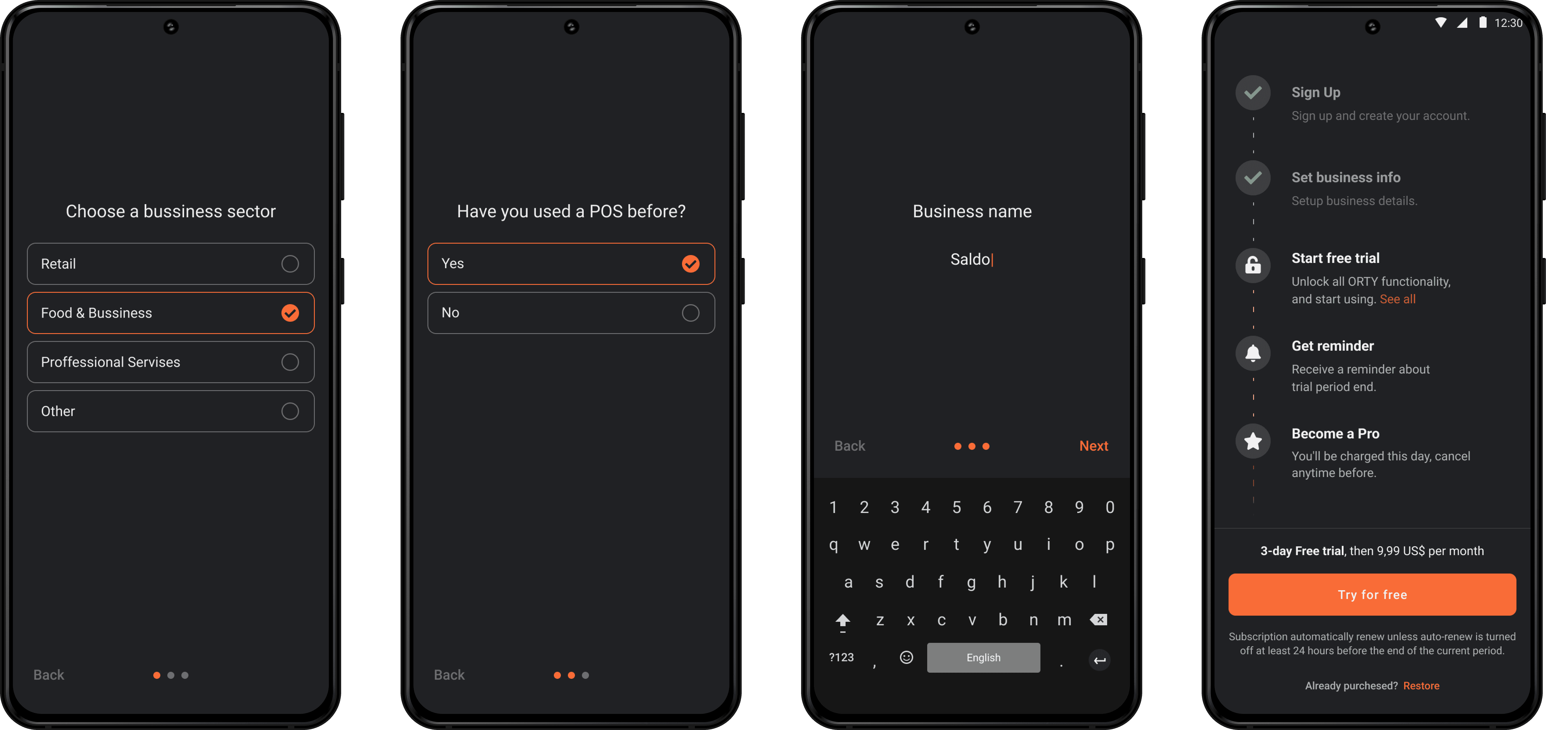
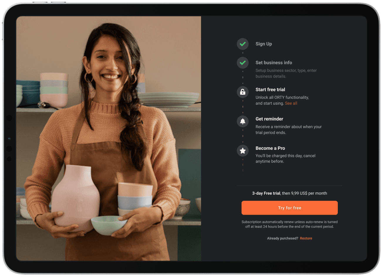
At a certain point, new users started skipping setup within onboarding, which caused a load on the support team later, since it was easier to ask support to set things up, instead of trying to find and set up on their own.

To understand user motivations and pains during the onboarding, we talked to multiple new users via Intercom chat, right after they joined. Main thought said - "I don't want to set things up before I see the app".

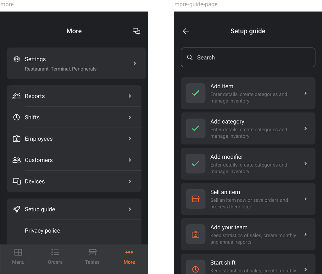
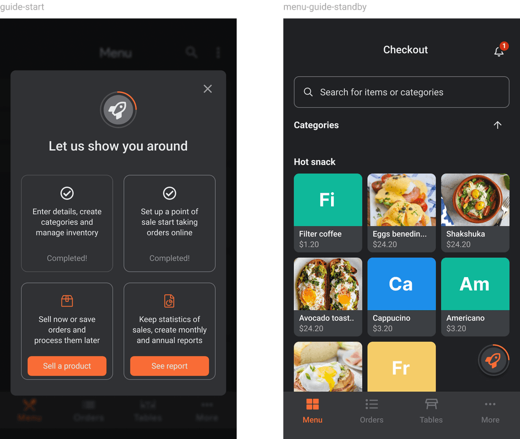
Here I am totally on the user side, so I proposed a reusable setup guide, which is accessible to the user after onboarding.

Users could exit the flow at any step, being able to return to the guide anytime. The Guide page lists all the app units, and if those are fully set up, allowing get to a desirable area with a single tap.

Categories and items navigation

Categories and items navigation

Categories and items navigation

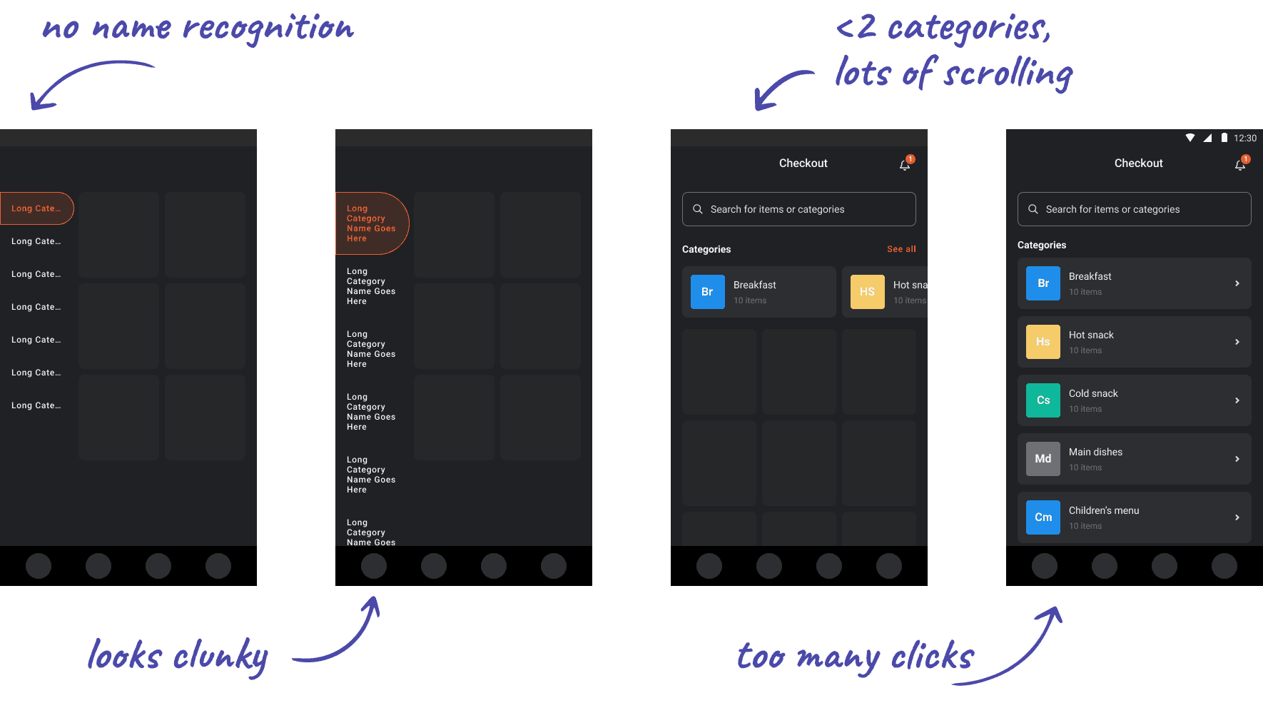
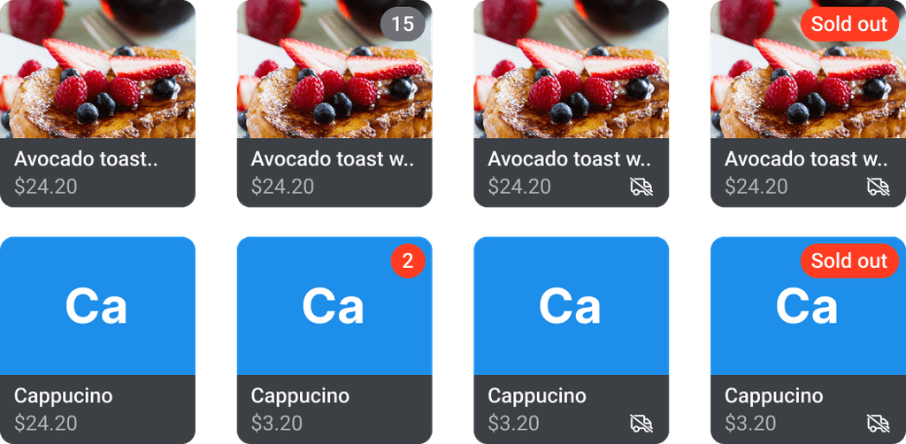
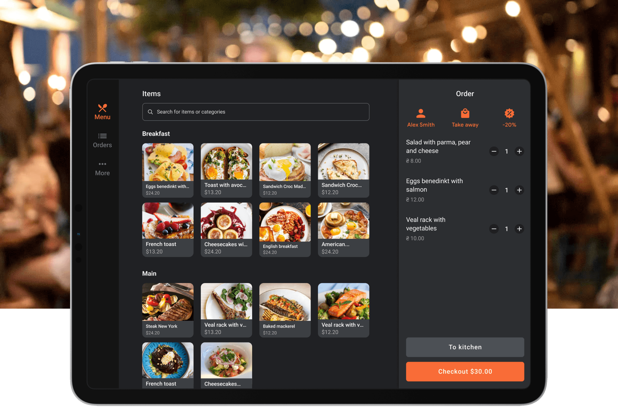
Catalog is one of the most used pages in the POS, where users search for items to make a sale, making quick ease of use - one of the key aspects. From our business perspective usability of this page defines retention, LTV, and eventually cost of acquisition.

Users were asking for vertical navigation, argumenting it with a greater amount of visible categories on a screen, which meant less scroll interaction for them. This version though had another issue - due to the limited space for category names, multi-lines were making it clunky.

I talked with users to see if I can take good parts from both options and make one that looks good and covers user needs.

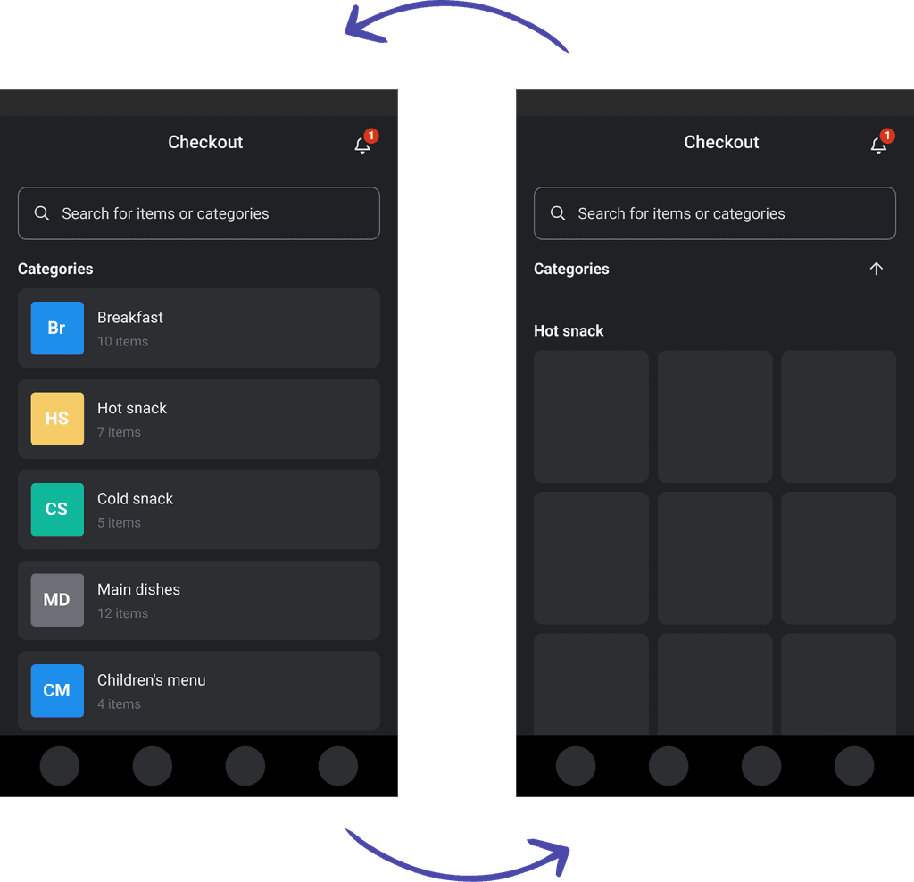
Through iterations, I came to a two-stage layout where the first section is for categories, and the second is a items grid, sorted by categories.

Users could quickly navigate between categories and item sections. Additionally, we added an easy-to-use smart search feature, enhancing overall speed and efficiency.

Payments methods

Payments methods

Payments methods

The more new users were joining the more feedback, and requests we were getting. One of the frequently received requests was around payment methods, and payment mechanics on the checkout page.

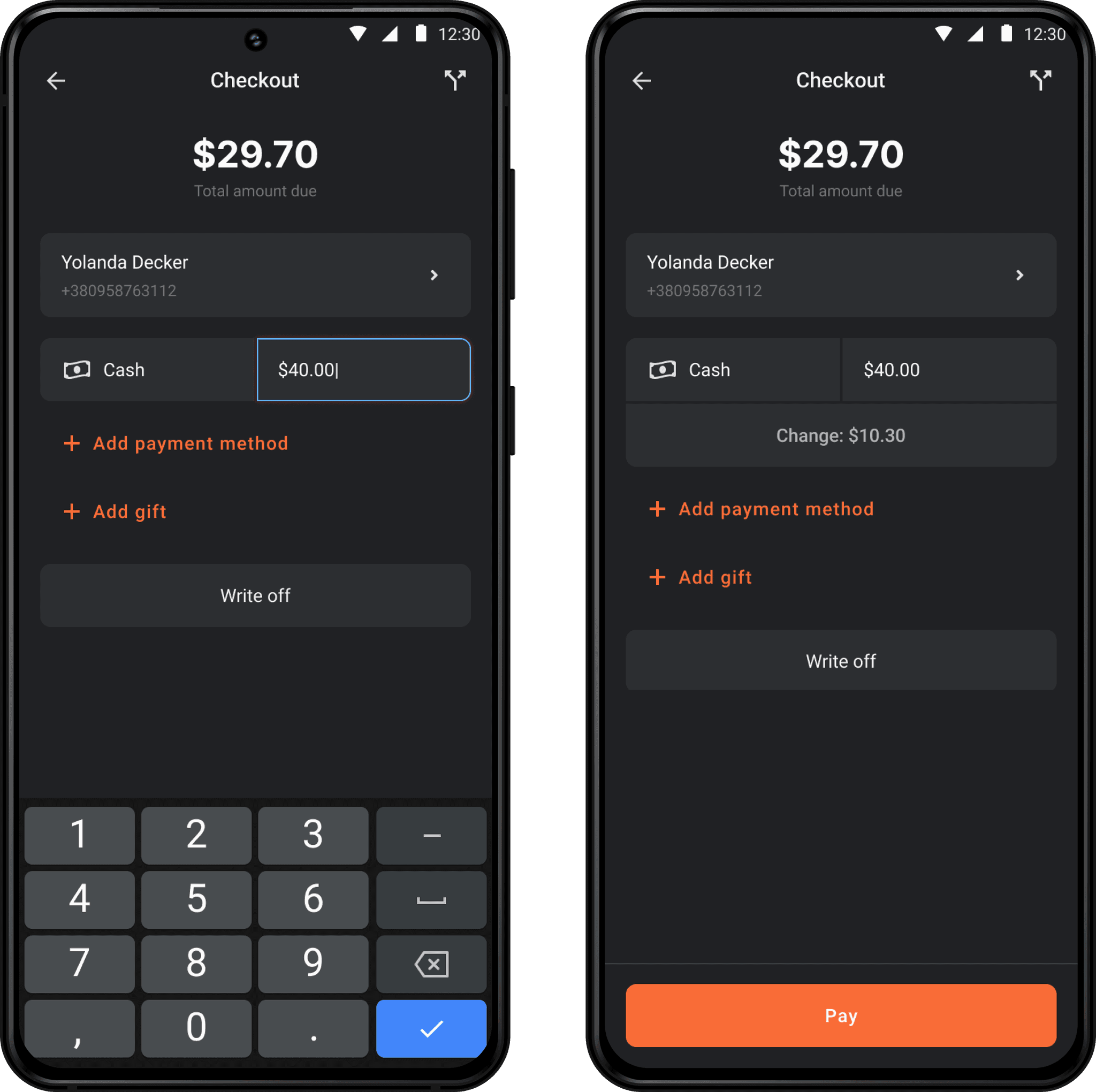
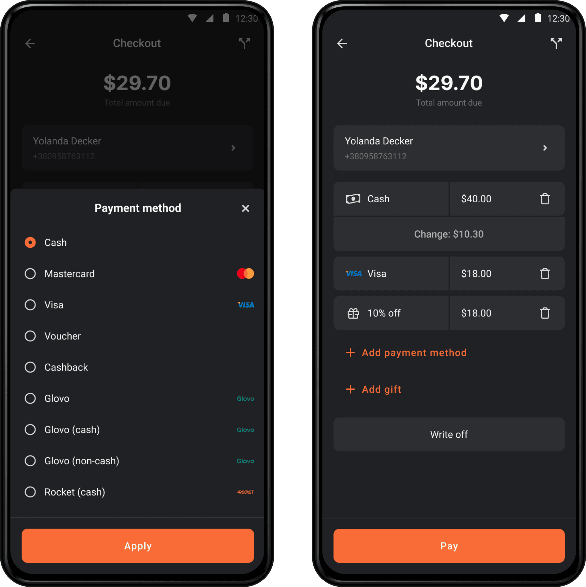
Users asked for methods like vouchers, pay later, and the ability to split checks into multiple payments allowing them to choose different methods for each.

To support such flexibility, I used a "dynamic query builder" pattern, that provides control over the query's composition, maintaining ease of use and visibility.

Stock items management

Stock items management

Stock items management

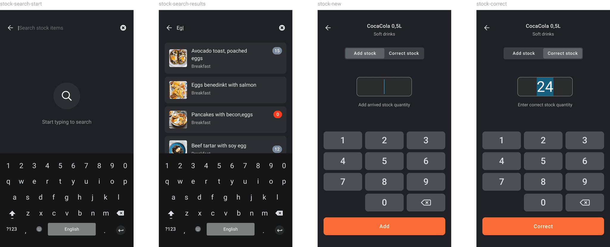
We got feedback that when a new batch arrives users have to sum up in mind the quantity of current stock + new arrivals. This leads to errors and slows the interaction in the fast-paced environment.

Due to other ongoing priority tasks, I had just a little time to come up with a working solution, so I spent some time on a call with customers to better understand the context, where, and how this interaction is usually happening.

I created a quick concept using our existing components. In a few hours, I came to a 2-tabs view with one auto-focused text field, so the user can enter quantity right after tapping on the item, and stock will be summed up automatically.

Team management

Team management

Team management

According to statistics, the average restaurant has staff turnover at least three times a year.

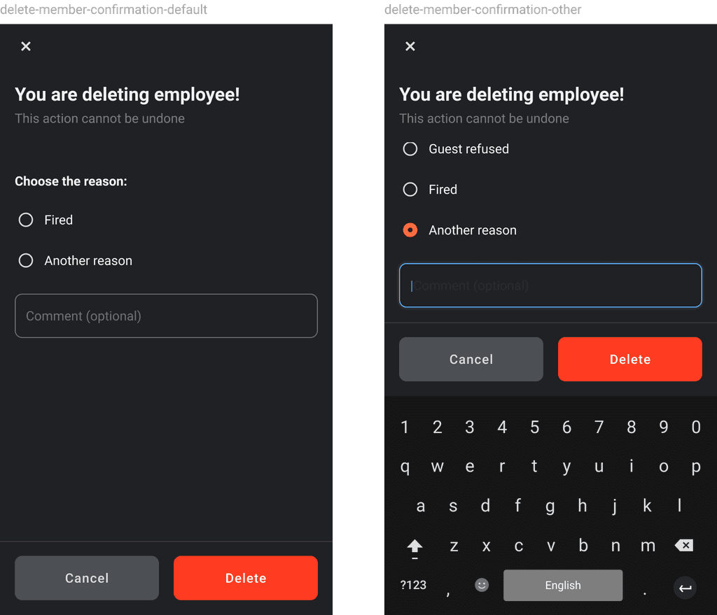
Taking into account that POS can be accessed from any mobile device, it is important to provide a usable way to add and remove employees to ensure secure work for the business.

There was another reason behind this functionality - admin actions like order deletion, venue editing, stock, etc. Such actions had an impact on business, therefor business owners with multiple team members wanted to limit access somehow.

We identified the most used roles in our app, with the help of a questionnaire inside the app.

Also, we added an onboarding flow for employees, so they can learn the device on their own, this way we covered one more pain point for business time spent on system education of new staff.

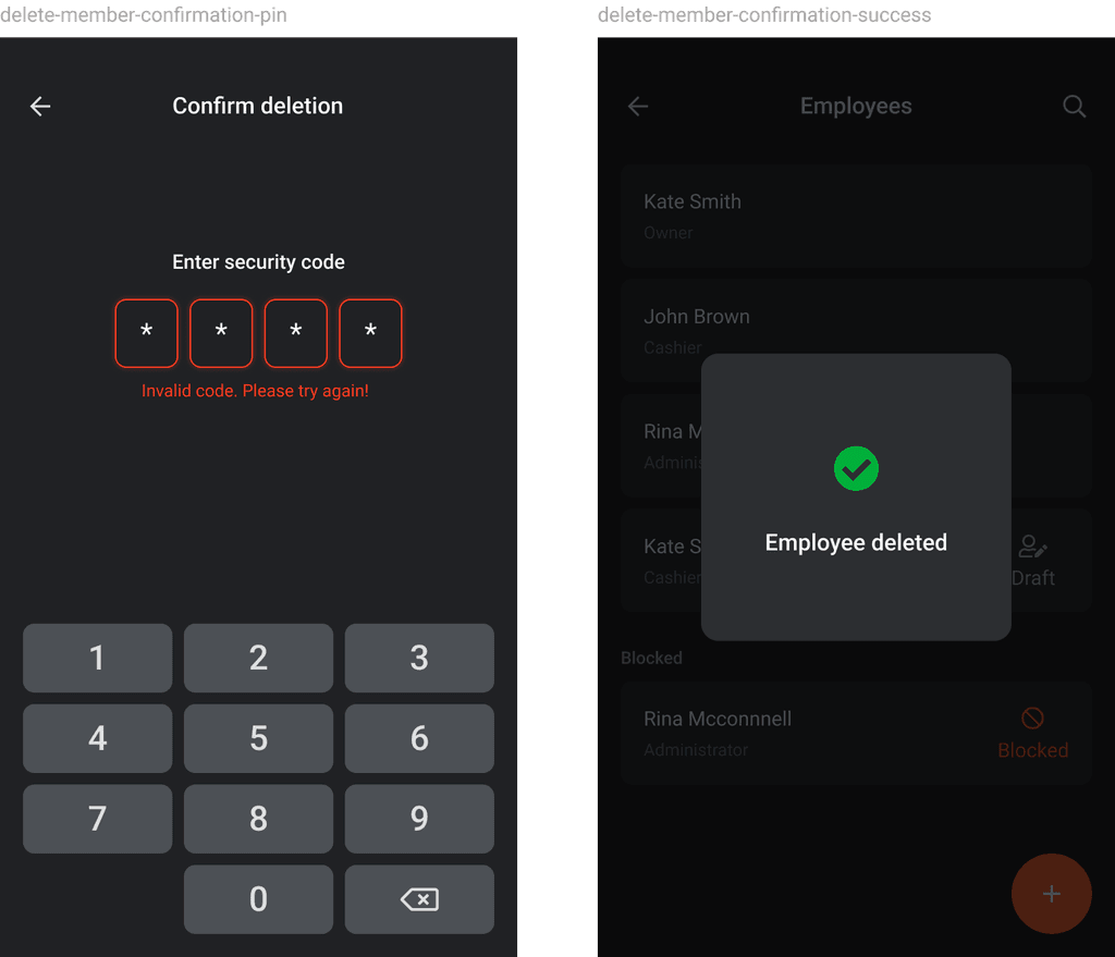
For important actions, we added one layer of protection, where the user had to enter a short 4-digit pin, for confirmation.

Shift overview

Shift overview

Shift overview

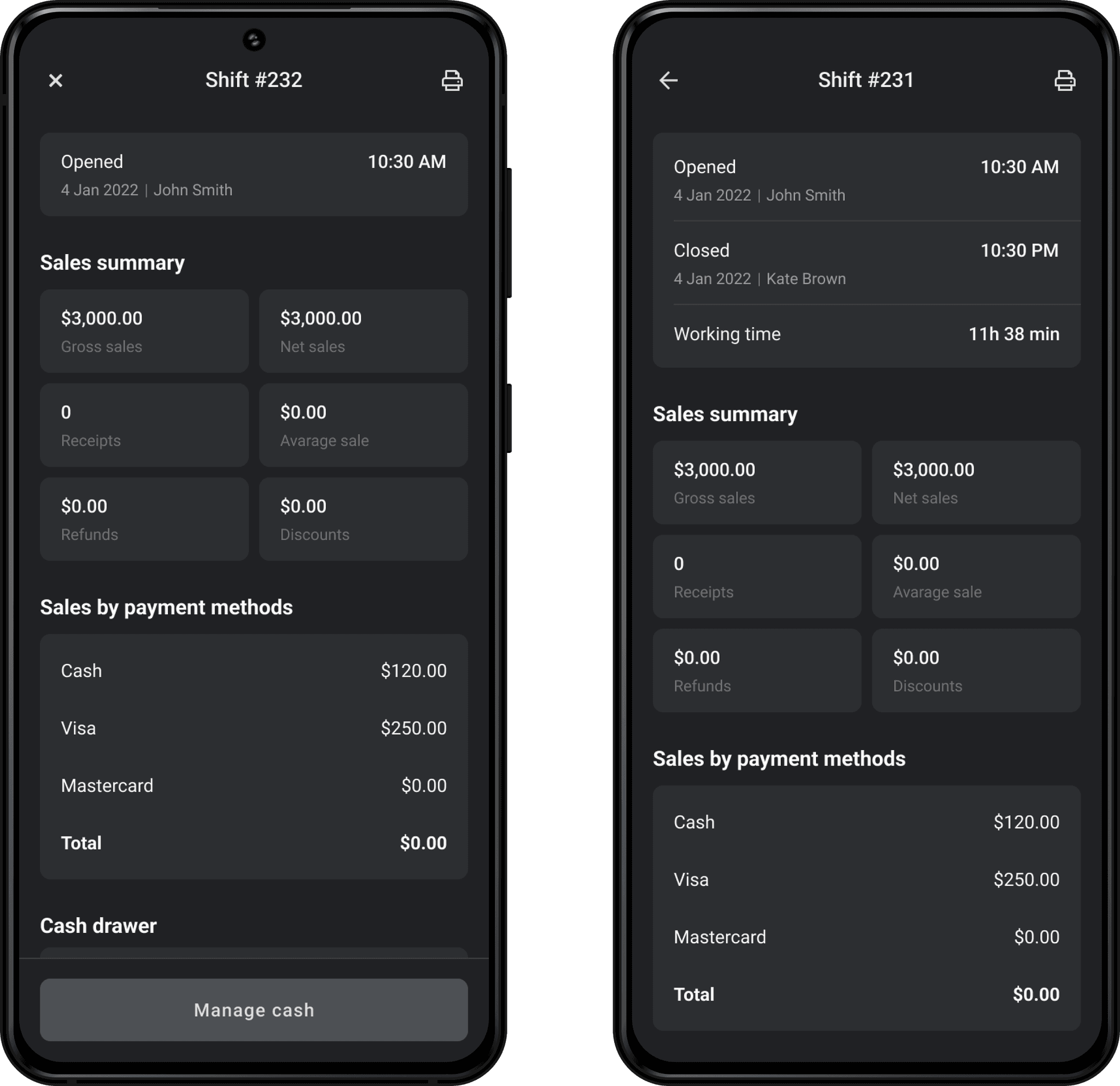
As an incremental feature delivery, we planned to release Shifts overview, so admins can view shift performance, by key metrics like Gross and Net sales and average checks both overall by shift or per employee.

Design system

Design system

Design system

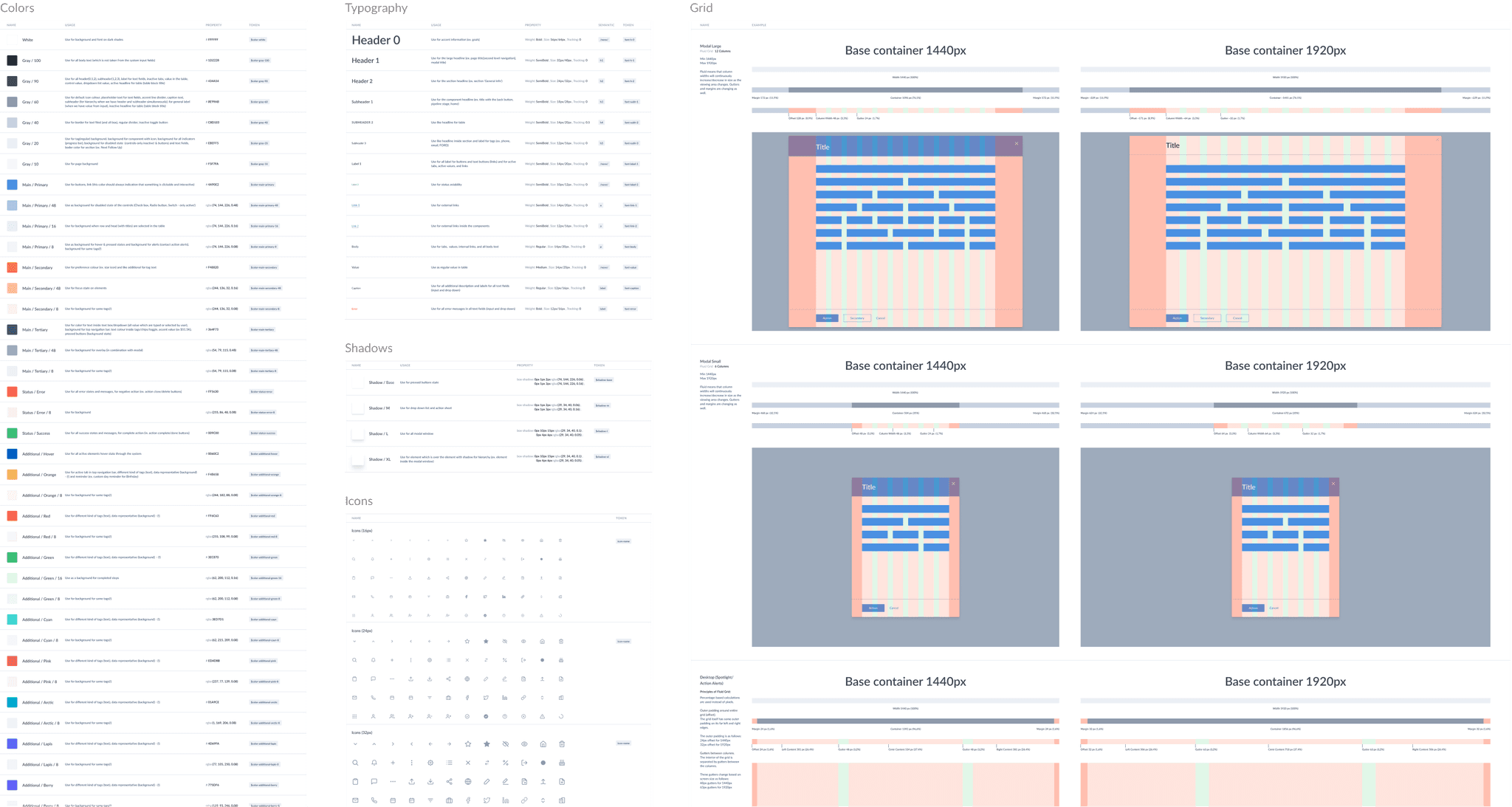
Due to the multiple platforms, and future plans for team expansion, we made the decision to set up a design system, which would help to preserve consistency, lower development costs, and speed up the design process.

I was in charge, of system development, and maintenance. I used tokens to automate the handoff process, so the change in Figma was syncing with the dev environment.

Later on, system was distributed to 3 more designers across 4 products.

Summary

Summary

Summary

This experience gave me way better picture of mobile app development as a whole. I got a new look at the support team's impact on product success, user acquisition, retention, unit economics, marketing, ASO, and much more.

I had a chance to improve my skills and gain new knowledge on Design System design, Android guidelines, and user behavior analysis.

Last but not least - never stop learning how important is empathy in work with people ❤️